

Boys, girls, education and interpreting statistics

A little abstract for you today.
My daily job is basically to interpret statistics. If you read my columns or other writings, I mostly centre on a statistics or set of statistics and then interpret them and then make an argument. For example, New Brunswick real GDP used to be 2.9% per year (average over a long period of time) and now it is running, let’s say, around 0.5% per year (depending on the number of years).
Which is more interpretative of the data for the average person? Real GDP growth has dropped by 2.4 percentage points or real GDP growth has declined by 83%? The math on both is correct.
I think for most people the latter is more digestible - and not just because of the starkness of the number 83 versus 2.4. It is because the 83 is more relatable to our real world experiences.
I have been reading/listening these days to stories discussing the gender gap in education. One researcher today talked about how in the US in the 1970s there was a 15 percentage point gap favouring men getting university degrees and now there is a 15 percentage point gap favouring women. Those data are not exact but it is for illustrative purposes.
That is not a bad framing but I still think it is not particularly relatable except that it sounds big.
Let’s put some #s on it. Again, I haven’t looked up the real numbers but using his frame it would look something like this. In 1970, 20% of men got a university degree and 5% of women - that is a 15 percentage point gap (or 4x as many men graduate than women or 400%). In 2023, 37% of women got a university degree and only 22% of men - that is a 15 percentage point gap but it is only 68% more women than men - still a big number but, again context matters.
This is another example of what I have been calling the denominator challenge.
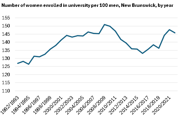
Anyway, when it comes to this kind of data I actually prefer looking at ratios. Look at the following chart. It shows the number of women enrolled in university by year in New Brunswick per 100 men enrolled. If you look at this on a percentage basis it kind of makes it harder to interpret as the share of women enrolled has gone from 55% to 59% over this period - or there has been a four percentage point change. To me this is not an effective and relatable use of statistics.
In our experience, 4 or 5 doesn’t seem like a lot with 55 as the base. However if we look at ratios and we look over time, we can better interpret the data.
For example, this idea that women just suddenly have taken over the university space is just wrong. Nearly 30 years ago there were 127 women enrolled in New Brunswick universities for every 100 men. Now it is higher at 146 but let’s not pretend this is new.
Looking at the data as a ratio allows us to think about what happened in the early 2010s. Using just percentage point data, women dropped by 60% to 57% in those years. Again, does that seem interpretative to you? Using the trend looks more stark and we can dig deeper in the data and see that the rise of international students was having some effect in those years as the roles are reversed (118 men for every 100 women). And the curve bent downward again in 2021/2022 because there were 135 men for every 100 women.
This is not a post about the plight of men. It is about the use of statistics.
But since we brought it up, I personally have no problem with the ratios of women to men in university. If more men want to pursue trades or other careers that do not require university, fine. If women end up earning on average a lot more than men. Fine, too.
What I am far more concerned about is the higher share of men opting to do essentially nothing. Not taking their careers or their lives as seriously as women.
But this is a topic for another day.